How C2SMARTER helped FDNY understand post-COVID emergency patterns with AirSage 

About C2SMARTER

The C2SMARTER Center is a Tier 1 University Transportation Center funded by the United State Department of Transportation (U.S. DOT) that is located at New York University. Dr. Jingqin (Jannie) Gao is the Assistant Director of Research and her team focuses on urban transportation research using data driven analysis and evidence-based support to help local and state governments on various issues including: infrastructure, connected vehicles, safety evaluations, and more.

Challenge

After the COVID-19 pandemic, FDNY experienced a higher number of emergency calls and slower emergency vehicle response times. FDNY was curious whether these changes were occurring due to a shift in people's travel patterns, including increased congestion from increased rates of car ownership. FDNY partnered with C2SMARTER to evaluate the root causes contributing to increased response times.

Led by Dr. Joseph Chow, Deputy Director of C2SMARTER, and Jannie, the C2SMARTER’s first task was to focus on a small neighborhood traffic-related study in West Harlem and Morningside, which are neighborhoods that represent underserved communities. Knowing that FDNY data told only one side of the story (emergency response vehicles), Jannie and her team began a search for other sources of data that would show how members of the public were reacting to an active emergency response vehicle—specifically, an ambulance in this case.
Decision

Jannie contacted AirSage. She had previously received two sample datasets from AirSage for other projects and knew they had trajectory level data, which provides much higher granularity than other types of data and is also a hard-to-procure data type.

After approaching AirSage, she learned that they could deliver trajectory data at a 30 second and 1-minute time aggregation. Most of the NYC traffic data was aggregated every 5 to 15 minutes. At a 5-minute time interval, the emergency response vehicle might have already passed an intersection where other cars had slowed down, so this level of data would not help Jannie and her team understand what had happened. With AirSage’s trajectory data at 30 second or 1-minute intervals, they could understand more about the particular timeframe when the emergency response vehicle passed the intersection and see if other vehicles slowed down. Jannie and her team needed to prove their hypothesis with data driven research rather than make assumptions, so they ultimately chose AirSage.


Preliminary Results

To understand what was happening when the emergency response vehicle crossed an intersection, Jannie and her team used a match process. They tried to match the FDNY data and AirSage data based on road segment at a certain 30 second time aggregation. They were able to match about 1,000 events between FDNY and AirSage data during a two-week period: 500 matches while the emergency response vehicle was enroute to the accident site, and 500 matches as it was going to the hospital with the patient.

Jannie’s team then looked at vehicle speed during the 30 seconds when the data matched to see what was happening. They focused on life-threatening incidents only for this comparison since the emergency response vehicle had very different behavior than during non-life-threatening incidents.

Because the AirSage data and FDNY data did not report speed in the same way, Jannie’s team did some post-processing of the AirSage data to ensure the speed calculations were an apples-to-apples comparison. They wanted to understand if there was a difference between the two parties. Their hypothesis was that most likely the general public had lower speed, and the emergency response vehicle had higher speed.

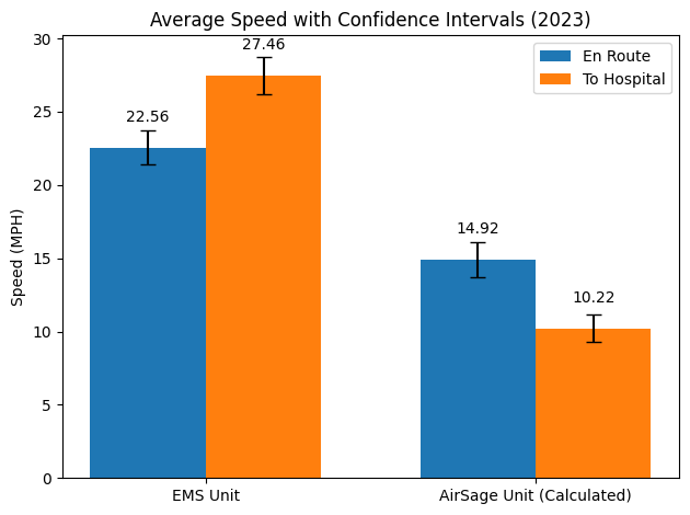
For the matches, the difference in the speeds between the two sets of data ranged from about 8 – 17 miles per hour (Figure 1) depending on whether the trip was enroute to the incident site or was going to the hospital. Thus, by looking at the AirSage data, they could prove that emergency response vehicles were going much faster than civilian vehicles.

Figure 1. Average Speed of EMS units (Ambulance) and AirSage Units with Confidence Intervals (2023)
To make it more meaningful, the team decided to see what happened before and after a timestamp match. For example, right after the timestamp of the match, was the AirSage speed going down and then back up? If so, that would possibly indicate that people are slowing down for the emergency response vehicle. Looking at the data, they did see a slowdown. The reduction was .5 miles per hour right after the matched incident time. However, unfortunately, that reduction was not statistically significant. So Jannie’s team is trying to investigate a bit more.

In terms of this analysis, however, AirSage data was able to prove at least one part of their hypothesis of how people are reacting to life-threatening emergency response vehicles at an intersection. If they just looked at length speed, they would not have gotten this level of insight to support this project.

Higher granularity

AirSage delivers data at 30 sec - 1 min time aggregation which offers higher granularity than location data from other data providers.

Data science expertise

C2SMARTER was able to communicate their research and data needs easily due to the AirSage team's data science expertise.

More insights

AirSage Trajectory Data offers insights on both vehicles and people which gave C2SMARTER a full picture of general population movement.
“What AirSage has is unique compared to other data providers – the high granularity of their data can provide much more information and help us look into more advanced and more complex areas like NYC.”


- Jannie Gao, C2SMARTER

Contact us to learn more

© 2024 AirSage Inc. All rights reserved.
cross