Using Location Data to Optimize Natural Resource Management - Webinar Recap
Introduction
On Wednesday, September 18, 2024, AirSage hosted a webinar featuring Arkansas Game & Fish Commission called Using Location Data to Optimize Natural Resource Management that highlighted the benefits and applications of location data in natural resource management. Speakers were Jason Szabatura, Location Intellignce Sales Professional for AirSage, and Joe Kaiser, Trout Management Biologist for Arkansas Game & Fish Commission. Jason revealed how AirSage sources and cleanses location data and described the specific products that benefit the natural resource management space. Then, Joe explained how he and his team used location data to make better natural resource management decisions.
About AirSage
Jason Szabatura started the webinar by providing background on AirSage and its more than 20-year history in the location data market. He then described AirSage’s unique differentiators that make it stand apart from other location data providers, including: its data sourcing and cleansing expertise, ability to customize, flexibility in providing data on or off platform, provision of empirical data instead of modeled output, and commitment to privacy and security.
Data Sources
Next, Jason presented how the AirSage data supply chain operates, which begins with users downloading mobile apps and enabling location-based services. AirSage collects data from millions of mobile devices and receives billions of sightings which is aggregated into a large pool of location information.
Jason confirmed that location data is still collected in remote areas like parks, mountain ranges, or trails where there is little to no cell service. The mobile apps collect and store the data when the device is out of service range and then transmits the data once the device reconnects to the network. This means that AirSage location insights remain comprehensive and accurate regardless of mobile device connectivity.
Data Cleansing
“Data cleansing focuses on selecting only high-quality devices that provide us reliable insights,” Jason explained. AirSage does this by removing duplicate sightings and disposing of other irregularities. Jason cited an example of a federal client who asked AirSage to prove the validity and quality of its data. This client had received fraudulent data from other providers in the past and wanted to ensure AirSage’s data was clean. After reviewing datasets of three interstates at pre-selected times, they were impressed with the high quality of AirSage’s data and ultimately selected AirSage for their project.
Privacy & Security
Next, Jason reiterated AirSage’s commitment to data privacy and security. He mentioned AirSage’s three-pronged strategy: 1) present only aggregate movement data 2) provide anonymized insights and 3) prevent any reverse engineering to safeguard individual privacy.
AirSage Products – Target Location Analysis & Activity Density
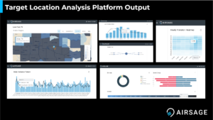
Jason turned his focus to AirSage’s products, and specifically, the two most applicable to natural resource management: Activity Density and Target Location Analysis. He described how Activity Density provides estimated densities of people located within grid cells overlaid onto a study area in the form of a heat map. Whereas, Target Location Analysis allows you to select certain points of interest where you can view insights such as home locations of visitors, visitor count, demographics, cross-visitation between points of interest, and more. Jason asserted that both products can be delivered via platform or CSV file.
He then showed an example of what the platform analytics looks like:
Examples of Clients in Natural Resources
To illustrate AirSage’s experience in natural resource management, Jason mentioned two publications written by the Environmental Protection Agency about projects that used AirSage data:
Additionally, he listed a few case studies that AirSage has conducted with natural resource management clients including Iowa Department of Natural Resources and Montrose Environmental Group.
Introduction to Arkansas Game & Fish Commission
Next, Joe began his presentation by providing background about his team’s discovery of AirSage. His Chief of Fisheries was approached by AirSage in early 2021 and obtained Activity Density and Target Location Analysis data for 2018 to 2022. He pitched the data to the Fisheries Division to see if they could come up with ways to use the data. Ryan Gary, who is now at Maryland DNR, and Joe had some ideas.
Trout Management Program Project
Joe mentioned that Ryan spearheaded the Trout Management Program project using AirSage data, which focused on Bull Shoals and Norfolk Tailwaters. These tailwaters are two of the most lucrative trout fisheries in Arkansas with millions of dollars supporting them, so the Fisheries Division manages them very closely.
Every 5 to 6 years, the Fisheries Division conducts creel or angler surveys on these fisheries to collect information on angling effort pressure. This information helps them decide on management decisions for those fisheries. For example, they use angling effort and angler catch rates to help pro rate their stocking rates on these fisheries.
Bull Shoals is by far the largest tailwater. It's approximately 90 miles of river which makes it challenging to survey in general. Norfolk tailwater is only 4.5 miles. However, there is still very high pressure on this fishery next to the White River, and they are both accessible to one another, which also makes them fairly prized by anglers.
Existing Data Collection Methods
In 2021 and 2022, Joe’s team conducted a yearlong survey. This effort included angler surveys where his team went out in boats and roved the river to get counts of angling activities. They counted people with rods and reels in hand as they moved up and down the river - both instantaneous and progressive counts.
Joe mentioned that his team also used aerial counts and still uses them today on some of their fisheries, particularly the tailwaters. For this survey, they contracted a small pilot group to conduct 91 flights over the course of the 2021- 2022 survey. The cost of the flights are in the vicinity of $100,000, which is a substantial financial obligation, and the roving boat surveys are also quite a bit of labor.
AirSage – Alternative Data Approach
Joe explained that the team decided to seek alternative ways in which they could either supplement their traditional data, or supplement their timeline of data. They conduct the surveys every 5 to 6 years so if they could get information between those 5-year gaps that was cost-effective and fairly accurate, they would appreciate it.
To obtain AirSage data, Ryan created polygons in Google Earth by outlining the area of interest where he wanted the data. Since Bull Shoals is such a large fishery, he actually had to develop multiple polygons for it. He also broke up the fishery into zones. He converted the polygons to Geojson files and submitted them to AirSage. He requested hourly count data in each of the cells for the entire year - from September 1, 2021 to August 31, 2022.
Ryan and Joe received the AirSage data and summarized the same dates as the roving surveys and the aerial counts to make the comparison one to one. Then they used instantaneous and progressive estimations for angling effort overall, for daily counts, and seasonal counts.
Aerial Data vs. AirSage Data Comparisons
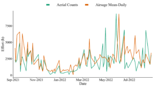
Joe showed the aerial count data for the entire yearlong survey. Within the data, there is highly variable changes at different times of year, particularly, during the summer months. When Joe overlayed that effort with the estimated mean daily counts from AirSage (below), he found a fairly significant correlation between the aerial counts to the mean daily estimates from AirSage. He pointed out that there are some areas where the trend lines almost perfectly overlap.
Bull Shoals Seasonal Counts
Joe and his team decided to look at seasonal effort as well since seasonal effort is very important for their management decisions. Looking at fall, spring, summer, and winter months, they saw insignificant differences between the fall, spring, and winter. They were not perfect measures, but they could find means of correcting to come up with accurate estimates between the two or to help supplement that data.
Looking at the summer seasonal estimated effort (below), however, he saw a significant difference between the aerial counts and the AirSage mean daily effort estimates. Joe cited a few reasons for why this could be:
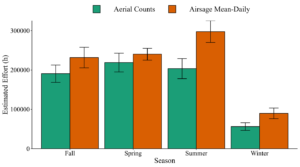
Joe and his team typically see very high pressure during the summer, but it was definitely encouraging to see the fall, spring and winter values line up with AirSage data a little closer.
Norfolk Tailwater Results
Joe explained that his team also saw significant correlation between aerial counts and the mean daily estimate of effort for AirSage at Norfolk Tailwaters. Just like with Bull Shoals, fall, spring, and winter lined up fairly well; however, they saw more significant differences between the aerial counts and the mean daily effort from AirSage for summer (most likely, for the same reasons above).
Family and Community Fishing Program Project
Joe turned to the next project in which his team used AirSage data, which was the Family and Community Fishing Program. The program was developed in the early 2000s to encourage urban dwellers that are not often exposed to nature to go fishing. It has 50 core pond locations that are split up into tier rankings. Tier 1 locations are higher priority and are stocked more frequently within the season, and Tier 2 locations are stocked less frequently during the season.
For this study, he randomly selected locations throughout the state that were stocked with both channel catfish and rainbow trout. The goal was to get good representation so his team could make some inferences for the program and help guide management decisions. For all locations, he randomly selected monthlong periods after a channel catfish or rainbow trout stocking had occurred for the study.
In 2021, during the pandemic, the Arkansas Game & Fish Commission started more specific marketing efforts for this program, which included YouTube advertisements, Facebook posts, and events like fishing derbies and educational events. So, Joe broke that four-year period (2019 – 2022) into two groups – pre-implementation and post-implementation of the increased marketing and events at the Family and Community Fishing locations. He randomly selected which year and which stocking event for channel catfish and rainbow trout for each location which provided him a sample size of 88 accommodations across the 22 ponds they selected.
AirSage Data Acquisition – Activity Density and Target Location Analysis
Joe cited that it is typically simple to acquire data from AirSage, but one tricky aspect was submitting a separate request for each of the 88 months selected for each of those randomly selected dates and times and for each location and for each stocking event. Even though it took extra time compared to selecting an entire year block of dates and times for a single location, AirSage was very obliging and made it fairly painless.
Activity Density
For Activity Density, he came up with four metrics to gauge activity at these locations within each of their groups. He looked at the average daily activity, average monthly activity, average number of hours within a day and average days within a month. He was hoping to see changes alongside implementation of certain marketing strategies.
Target Location Analysis
Using Target Location Analysis data, Joe looked at the changes in percent of different ethnicity groups, age groups, and percent income groups - all of which are fairly represented from the US Census.
Activity Density Results
He did a pairwise comparison with the main effects of the implementation of marketing and events for the Family and Community Fishing locations and between the Tier 1 and Tier 2 locations. He was also interested to see if he could detect any significant relationships between the data he acquired for Activity Density to characteristics of the Family and Community Fishing Program.
Along with the implementation of different marketing strategies and tier ranking, he wanted to look at pond locations that were located within a densely populated area (greater than or equal to 20,000 folks in a given city) and specific stocking rates at those locations. The main question was: if you stock more fish, are more people going to come to these locations? To answer the question, he conducted a stepwise regression using the Target Location Analysis data.
Joe presented the comparison results (below). Looking at tier ranking results, he saw that with more frequent stockings, there was greater average monthly activity, daily activity, the number of hours per day and number of hours within a given month. He was not surprised by this result. Some of these Tier 1 locations get a lot of pressure. However, something interesting that Joe saw when looking at post-implementation of marketing at the Family and Community Fishing locations was he didn't see a significant change in the average monthly activity. He actually saw a decrease in the average daily activity but an increase in the average number of hours and days per month of activity. It might be concerning that there was a decrease in this daily activity. However, it also could be that the data is picking up on different activity due to implementation of marketing and events at these locations.
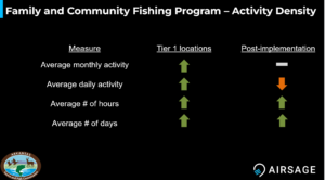
To summarize, Joe explained that there were fewer folks on a daily basis, but they were staying at locations longer in a given day, and more people across the entire month were showing up more days in a month which was very informative for determining which strategies work best for the program.
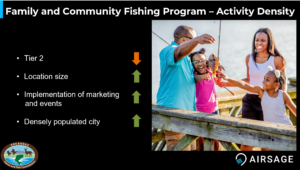
Joe and his team looked at all four of the activity density measure in relation to different characteristics of the Tier 2 Family and Community Fishing locations (see results below). A less frequently stocked Tier 2 location tended to see less activity. If it was a larger pond, it had more activity. After implementation of marketing and events at the Family and Community Fishing locations, his team saw more activity. More densely populated areas had increased activity. These numbers made sense to Joe and his team.
Next, Joe presented a figure (below) that was part of the model for the mean daily activity post implementation. The graph showed increasing stocking rates on the X-axis and increasing daily activity on the Y-axis. The solid, diagonal line going across the graph is the model projection for the post implementation of marketing in a densely populated area. The points along the graph, which are the actual observations of mean daily activity, actually do not follow the trend very well. As stocking rates increase, it's a flat line trend and a clustering towards that front end of the X axis which is fewer stockings.
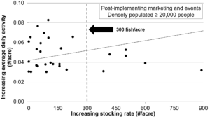
One inference was the team could stock less fish in the densely populated areas and get the same amount of activity. However, when they couple it with marketing and events, they see heightened daily activity that actually is above the projected line at those lower stocking rates. Based on this visual, Joe’s team concluded that they don’t need to be stocking that many fish at one time. They could increase the number of Tier 1 locations or stock locations more frequently in general.
Target Location Analysis Results
The results of the Target Location Analysis data actually followed many national, regional, and state specific human dimension surveys on anglers. Across Joe’s two categories (post implementation of marketing and tier locations), the majority of people were generally Caucasian.
One of the groups that notoriously is missing in many of the recruitment, retention, and reactivation of angular efforts across the state is the 18 - 34-year-old age range. Within the Target Location Analysis data, a fairly consistent percentage of that age range was represented within the data. Joe’s team also saw that most people had an annual income of less than $75,000. They didn't have any direct results from the Family and Community Fishing locations to validate these findings, but they do match up with other reports that they’ve seen on larger spatial scales in the US.
A very informative insight for Joe’s team was the ethnicities found in the Target Location Analytics data. They saw fairly great representation of Caucasians and fairly consistent representation of African Americans, native Americans and Asians. However, they saw an increase in the total Hispanic (and Other) population from 6% to 12% after implementation of marketing and events for the Family and Community Fishing locations (see below).
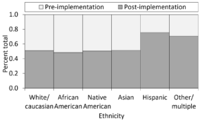
If this truly is an accurate representation of those lesser represented angler groups, and Joe’s team was able to reach them with their marketing and increase their representation, that's a really powerful tool for this statewide program.
Conclusion
Joe closed his presentation by reiterating the importance of cross validation of methods when evaluating location data. He suggested that others make sure that both the Target Location Analysis data and Activity Density data line up with angler surveys and in programs like the Family and Community Fishing Program.
He also suggested testing different spatial scales. For example, his team evaluated both a large tailwater fishery and a small tailwater fishery with very high angling pressure and effort. They also used a slurry of different ponds across the state of Arkansas to evaluate the Family and Community Fishing Program.
Finally, Joe concluded with this message: “We're always trying to optimize our data collection. Creel surveys and human dimension surveys can be logistically and financially challenging. So, especially if you can validate it, there is an opportunity to not only cost save but also save a lot of time or supplement the information you have with AirSage data.”
Next Steps
To watch the full webinar Using Location Data to Optimize Natural Resource Management, please go to: https://airsage.com/webinars/. If you have further questions or want more information about Target Location Analysis data, contact AirSage at sales@airsage.com.